

Tuesday 25 September 2012
Monday 10 September 2012
Accessory
In week 6 class we also drew a fashion accessory. I based my technical sketch off a Marc by Marc Jacobs wallet. I own this wallet so I was able to view it from all angles and draw the details correctly.

Knitwear
For week 6 we were required to draw knitwear. We were taught how to create a cable-knit repeat and ribbing. I found this aspect challenging as its hard to make a pattern repeat seamlessly. I decided to draw a Stella McCartney cable-knit skirt rather than the typical jumper or cardigan, however I was still able to incorporate the ribbing detail in the waist and hem of the skirt.

Wednesday 5 September 2012
Jacket
My technical sketch is based off a blazer from Abercrombie & Fitch. Drawing the lapels and getting the right shape of the blazer was a bit tricky. I also experimented with adding a drop shadow which I think makes it come off the page more. Overall I feel that I've improved a lot with using the pen tool on Adobe Illustrator.

Wednesday 29 August 2012
Shirt
For week 4 we were taught how to draw shirt technical sketches and make a stripe and polka dot repeat. I made a basic black and white striped repeat and applied it to my shirt. I am pretty happy with the end result.

Wednesday 22 August 2012
Dress
My dress technical sketch is of a Zimmermann dress. I thought it was interesting because of the panel lines and drape of the skirt. It has a concealed zip closure at the back so I didn't have to use the zipper brush.

Skirt
In week 3 class we learnt how to make a zipper brush. I applied the zipper brush to my technical sketch of a Sandro skirt.

Wednesday 15 August 2012

Shorts
The first technical sketch we were required to draw were a pair of shorts. I drew a pair of high waisted shorts from my favourite designer, Isabel Marant. I'll admit that it took me quite a few times of drawing shorts to achieve an end product that I was happy with. I learnt that reducing the stroke weight when drawing small details such as topstitching makes for a more realistic technical sketch.

Monday 13 August 2012


Friday 27 April 2012
Pattern ideas

This was my very first shell-inspired pattern.

In this pattern I continued the black and white palette but I used more interesting and better quality photographs of shells.

In this print I experimented with my micro photographs and some colour. I decided that my previous patterns were too plain. I selected a swatch from a heavily textured shell that I had photographed and filled the outline of my scallop shell with it. I think the contrast between the black and white and orange is nice.

Here I have formulated my final pattern. This is the first version of it where I have filled in all my shell motifs with the pattern swatch. I also added a pink-ish background which I think goes quite well with the colour of the shells. It took me awhile to create this pattern because every time I repeated it there would be track-marks where the pattern swatch did not match up completely.

Here's another variation of the above pattern. I have to decide which out of the two patterns I will hand in. At the moment I think I prefer the first version (with the enlarged shell), however I will seek others opinions before I make the final decision.


Shells: micro and macro
I have decided that the most effective way for my print to reflect my neighbourhood (Coogee) is by theming it on shells. Today I found a large amount of shells that I have collected over the years, some of which were from Gordon's Bay, an aquatic reserve five minutes away from my house. Gordon's Bay is also one of Sydney's most popular diving sites.


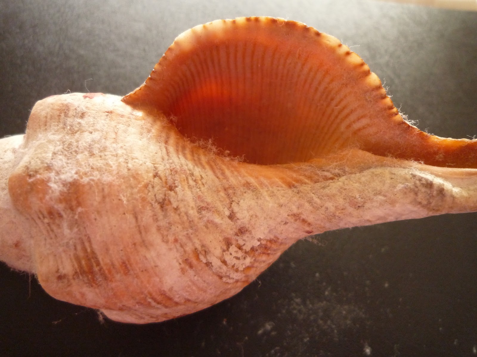

I'm going to try making a half-drop print with three of the shells as motifs; the scallop, spiral and tulip shells. I'll be turning them into black and white stencils but I still need to think of a way in which I can include the micro aspect of the shells in the print.
Wednesday 25 April 2012
Underwater inspiration
 |
| Harper's Bazaar Australia Collections spring/summer 2012 p. 93 |
 |
| Harper's Bazaar Australia collections spring/summer 2012 p. 92 |
Saturday 21 April 2012
Stencil
As mentioned in my previous post regarding the prints of Florence Broadhurst I'm considering making the print for my assignment in black and white. In week 5 we learnt how to turn a black and white photograph into a stencil using Photoshop. I'm thinking about adopting this technique to create a motif that has a stencil look to it.
I experimented with this technique using a starfish image.

In Photoshop I was able to create the stencil effect by setting the file on grayscale mode and adjusting the input levels to remove the grey. I pulled all the input sliders into the centre until the only colours remaining were black and white. An alternative tool which I also tested out and achieves the same effect is the threshold tool. Like the levels tool, the threshold tool makes all the pixels in the image to be either black or white. I adjusted the threshold slider so that I could get as much white detail.
Research: Florence Broadhurst prints
Florence Broadhurst was an Australian designer who owned a successful wallpaper and textile company based upon her own designs. Florence had a signature style of black and white or brightly coloured geometric and nature-inspired prints. I love her black and white prints because they are very striking and versatile. The following images have been taken from Signature Prints.


After seeing these I am inspired to produce the print repeat for my assignment in a black and white colour scheme. The reason for this is because Florence's designs demonstrate the way in which a black and white palette can make for highly effective prints. Black and white reflect neutrality and can create a very minimalist and contemporary feel.
Friday 20 April 2012
Research: floral
I've started to conduct some research into floral prints as I am considering theming the repeat print for my assignment on plant life. The repeat I create is supposed to reflect an aspect of my neighbourhood. I could gain inspiration from the garden of my house, specifically the flowers in it (roses, camellias, frangipanis and magnolias). Alternatively, the suburb in which I live is very much a beach suburb as it's beach is one of the most popular in the eastern suburbs of Sydney. In this case, I could look at its sea life, for example I could use shells or coral as motifs in my print.


Zimmermann prints:

Dries Van Noten/Alice and Olivia/Proeza Schouler/Marni prints:

Half-drop repeat experiment
Today I experimented with creating a half-drop repeat pattern in a camellia print. I made two variations of the camellia motif as I didn't want my pattern to repeat the exact same motif. I did this through using the offset tool and then filling the centre of my image with the second camellia. The only variation between the two flowers is that the flowers and leaves are in different directions. I also played around with filters in order to give my camellia a grainy effect.
 |
| Original flower: http://upload.wikimedia.org/wikipedia/commons/9/96/Camellia_japonica_flower_2.jpg |
Thursday 19 April 2012
Types of repeat patterns
1. Half drop repeat
 |
| http://friedahor.files.wordpress.com/2012/04/slide11.jpg |
2. Brick repeat
 |
| http://3.bp.blogspot.com/-rxSM5LZ_pqo/T10ZMGWjWPI/AAAA AAAABpQ/f14m3HDdWuE/s1600/moorish+half+drop.JPG |
3. Stripe repeat
 |
| http://www.layoutsparks.com/1/140826/pink-white-striped-pa ttern.html |
4. Spot repeat
 |
| http://s3.amazonaws.com/spoonflower/public/design_thumbnai ls/0092/1899/rpatricia_shea_heidi_polka_dot_repeat_150_shop _preview.png |
5. Diamond repeat |
| http://farm4.static.flickr.com/3154/2567724871_0ea1f47127.jpg |
5. Toss repeat

6. Ogee repeat
 |
| http://farm5.static.flickr.com/4056/4457906797_1f8e20892f.jpg |
7. Mirror repeat
 |
| http://www.betafashion.com/submissions/large-preview/origina l/2817.jpg |
Subscribe to:
Posts (Atom)